|
About a month ago the US Department of Education released the three-year cohort default rate data. Check it out here: http://www2.ed.gov/offices/OSFAP/defaultmanagement/cdr.html Student loans are currently all over the media. The increased attention has lead to accreditors, institutions, and governments focusing in the metric. In this post, I will describe the 2013 default rate data and provide a sense of the rates by State. In future posts, I will analyze the various institution types and how default rates differ. My first chart simply shows the distribution of the student loan default rates of institutions throughout the nation. You can see that the rates are positively skewed with a few outliers above 30%. 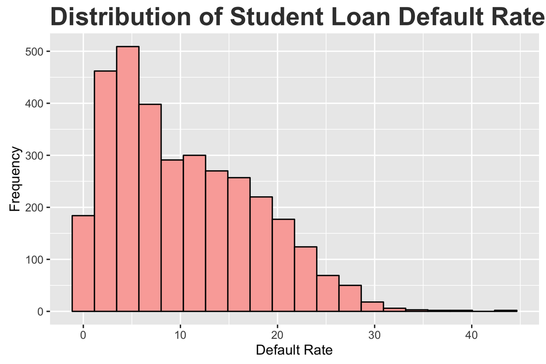
The map below shows the default rates by state. The darker the state, the higher the default rate. There appear to be some patterns related to region and I will explore this in another post. 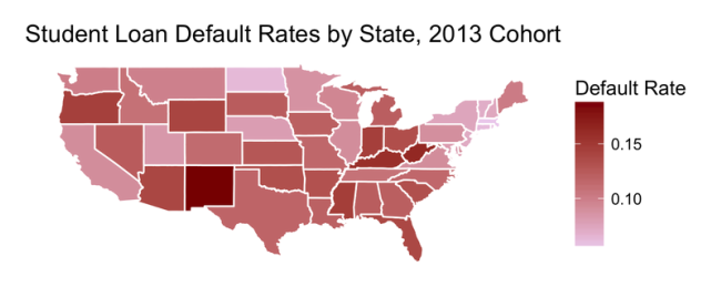 To better understand the chart above, the chart below shows each state ranked by its student loan default rate. The orange states are above average and the blue states are below average. 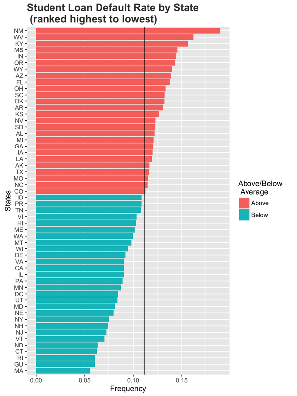 This is my first post related to data in higher education. I hope to post a weekly blog about open data in higher education. If you have ideas or questions related to this post send me a tweet (@datadanlarson). Additionally, I will share my R code on github so that you can analyze the data if you would like.
0 Comments
|
AuthorWrite something about yourself. No need to be fancy, just an overview. ArchivesCategories |
 RSS Feed
